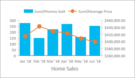
The new features in MS Access allows the user to create and visualize data with charts.
Choose from 11 new charts and make it easier to understand the data stored in forms and reports. Match fields to chart dimensions and preview your changes instantly.
Here’s just a sampling of the new charts you can use in your Access databases.

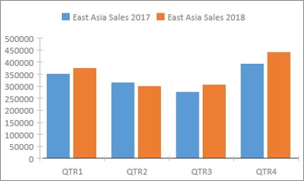
In a column chart, categories display along the horizontal axis (Axis (Category) property) and values display along the vertical axis (Values (Y axis) property).
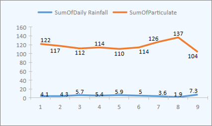
In a line chart, categories are distributed evenly along the horizontal axis (Axis (Category) property) and values are distributed evenly along the vertical axis (Values (Y axis) property).
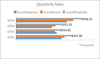
In a bar chart, categories are organized along the vertical axis (Values (Y axis) property) and values are organized along the horizontal axis (Axis (Category) property). Bar charts reverse the normal placement of the axis and values dimensions.
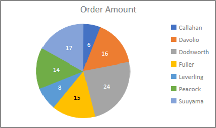
In a Pie chart, categories show as pie slices (Axis (Category) property). Data values (Values (Y axis) property) are summed as a percentage to a whole shown as the pie circle.
A Combo chart combines two or more chart types, such as a clustered column chart and a line chart, to explain different but related data.
