by Peter Obikpe | Feb 16, 2026 | Microsoft Excel Articles
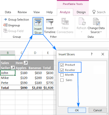
Slicers in Microsoft Excel are powerful tools that allow users to filter data in tables, PivotTables, and PivotCharts interactively. They provide a visual, clickable interface that makes filtering easier, faster, and more intuitive than traditional filter menus. This...
by Peter Obikpe | Feb 16, 2026 | Data Analysis
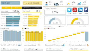
Power BI provides a wide range of visuals for presenting data, but raw charts and tables often need professional formatting to be truly effective. Proper formatting enhances readability, highlights important insights, and makes dashboards look polished. This article...

by Peter Obikpe | Feb 16, 2026 | Data Analysis
Power BI is powerful for visualization, but its true strength lies in DAX (Data Analysis Expressions). DAX allows you to move beyond basic totals and create intelligent, dynamic, and business-ready calculations. This article explains what DAX is, how it works, the...
by Peter Obikpe | Feb 16, 2026 | Data Science
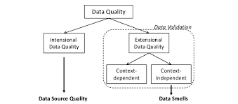
Data cleaning is one of the most critical steps in the data science workflow. Before analysis, modeling, visualization, or reporting can happen, the dataset must be accurate, consistent, and reliable. In fact, many professionals agree that data cleaning consumes up to...
by Peter Obikpe | Jan 31, 2026 | Data Science
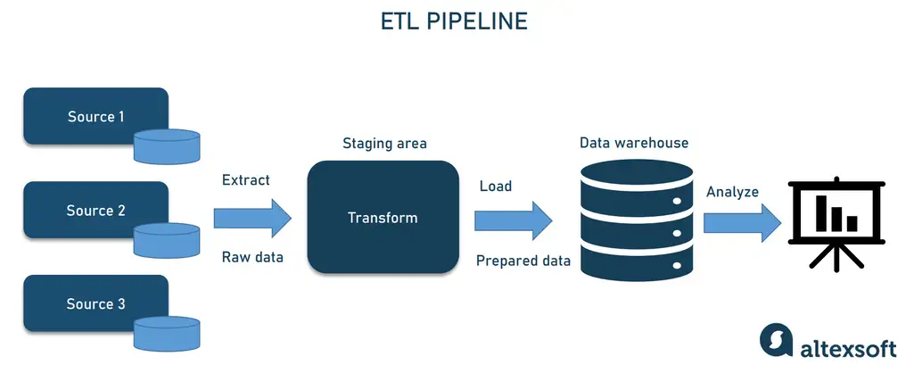
Data Science promises insights, efficiency, and smarter decision-making—but the reality is stark: over 80% of Data Science projects fail to deliver tangible results. The reasons are often not technical, but rooted in planning, communication, and execution. This...
